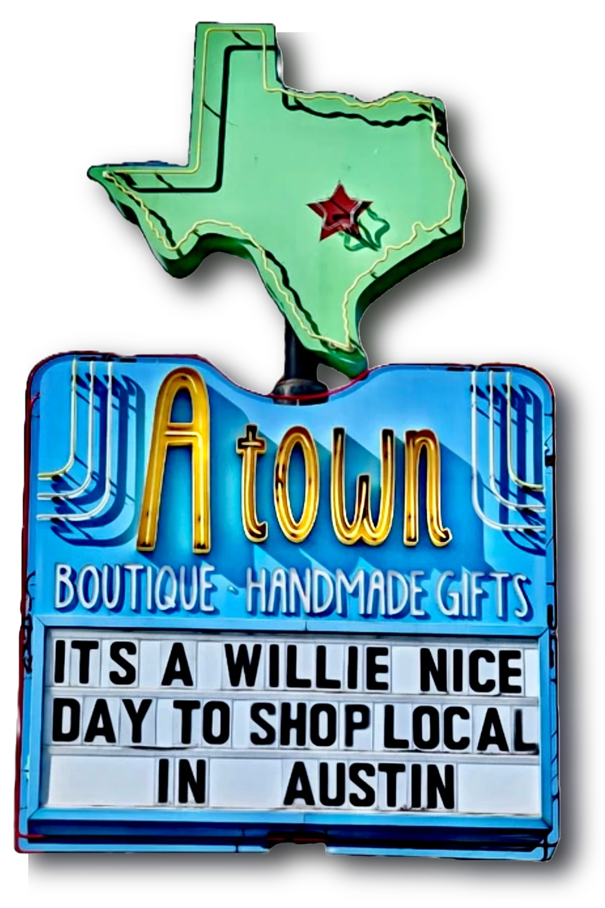
Atown Reimagined
Revitalizing Atown's e-commerce website, this conceptual project focused on creating a seamless and intuitive navigation experience, capturing the essence of Austin and the beloved local shop.
Austin's Favorite Gift Shop
Atown was created with a goal of bringing Austin's boutique, creative art, and music scenes together into a place where one can find quality, unique products that carry with them the essence of the city. I know this to be true, myself, because I have walked through those doors to experience a plethora of quirky, fun gifts to be sold. Everywhere you turn, there's something new to see as if the shop never ends.
However, upon visiting their website, I noticed that it didn’t seem to capture the same vibrant, eclectic spirit I’ve come to associate with the store. The website presented inconsistencies in the information provided, a navigation system that was difficult to follow, and an overall lack of cohesion that made it challenging for users to experience the store’s unique personality online.
It was clear that there were opportunities to improve the user experience, ensuring that both Atown's customers and the business could better connect and meet each other's needs.
It was then that I determined the need for a deeper insight into the minds of Atown's "ideal customer".
TIMELINE
2 week sprint
TEAM
Tiana Olivo
TOOLS
Figma
Illustrator
Procreate
Google Suite
Adobe Express
RESPONSIBILITIES
UX Design
Branding & Identity
Project Management
Website Development
RESEARCH
Revealing the Gaps
I recruited 4 participants from my personal social media account, who shop locally for gifts then gave them simple tasks to complete on Atown's current site including browsing for a gift and checking out.
4/4 users
failed to narrow down the search for Austin-themed gifts (rather than locally-made)
completed the tasks with at least 3 errors
experienced some type of navigation issue
3/4 users
attempted to filter search results by category but failed due to limited filters
clicked on "New Arrivals" first
2/4 users
completed the tasks after 15 minutes
didn't have access to their preferred payment method
Guiding Atown to Success
Clearly, every user was able to complete their tasks but not without difficulty. Global navigation for the site included inconsistent headings that often revealed an empty page or lacked clarity in its description. Plus, the few filters they offered weren't enough to narrow down the search, therefore, leading to confusion and loss of interest in the site.
What Atown needed was a full redesign complete with a new navigation system, clear and organized search filters, and consistent branding. With this in mind, I carried on my research to find out how competitors in similar categories are succeeding with their own websites.
Crafting a Competitive Edge
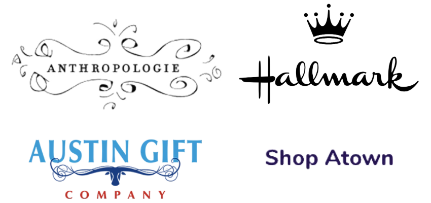
When looking at companies to compare, I felt it was best to choose 3 very different options. Anthropologie is a high-end store known for a wide variety of products including many gift options. Hallmark is similar, yet more of a conventional gift shop and Austin Gift Company is right in line with Atown yet features an updated and curated site.
What do they have that Atown doesn't?
A carefully crafted logo or branding
Catered shopping experience for specific gift budgets, preferences, occasions, and/or recipients
Wide variety of filters and categories to help users easily find exactly what they’re looking for
Stylish and inviting user interface
Organized and intuitive shopping experience, making it easier to explore options
Hours & location
SYNTHESIZE
From Insight to Action
However, before I could get to designing, I needed to nail down the issue at hand.
Users need a seamless way to find and purchase the best Austin-themed gifts that align with their preferences, budgets, and occasions, without feeling overwhelmed or uncertain during the process.
So to help solve this problem, let me introduce to you, Erin Mintz.

Who is Erin Mintz?
Erin is modeled after research from my user interviews. They represent Atown's target customer as a way to define the problem to develop clear solutions. Let's get to know them…
Loyal Austinite who loves supporting local businesses & artisans
Values high-quality, unique items
Seeks connection with the store, the products, & the people behind them
Prefers detailed product information to make informed decisions
Enjoys browsing local shops to find the perfect gift
Will resort to Amazon if they can’t find what they need locally, appreciating the streamlined process and fast Prime shipping, despite the lower quality
Drafting the Journey
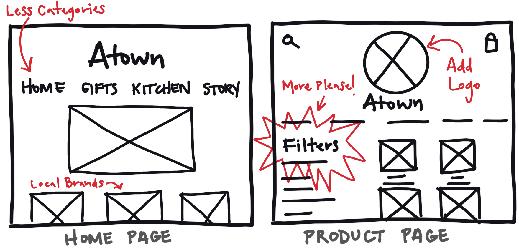
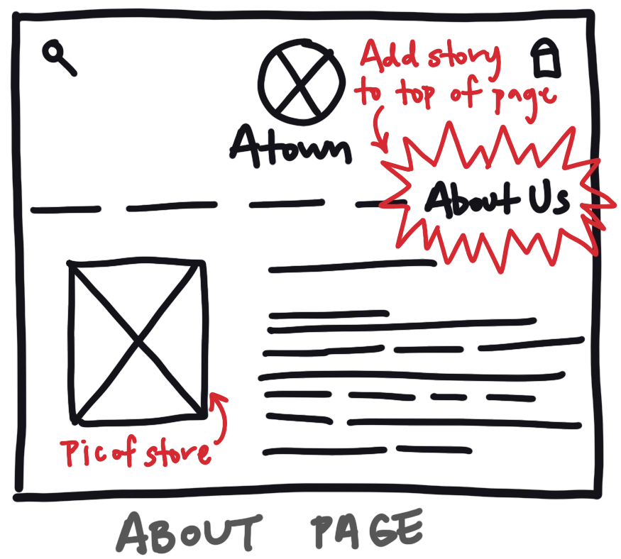
With Erin's profile established, it was time to start sketching up ideas that would suit her individual needs. Listed below are the 3 main points I wanted to address according to Erin's needs with potential solutions for each one. I then sketched a few basic screens to start illustrating how this could come into play.
Make it easier to locate specific products on site
reorganize the nav menu
incorporate filters by category
change the way search results appear
Find better ways of informing users
cater to the preferences of gift recipients
create a clearer sense of what the store is about through branding
include store hours & location
Help users feel more connected to the store
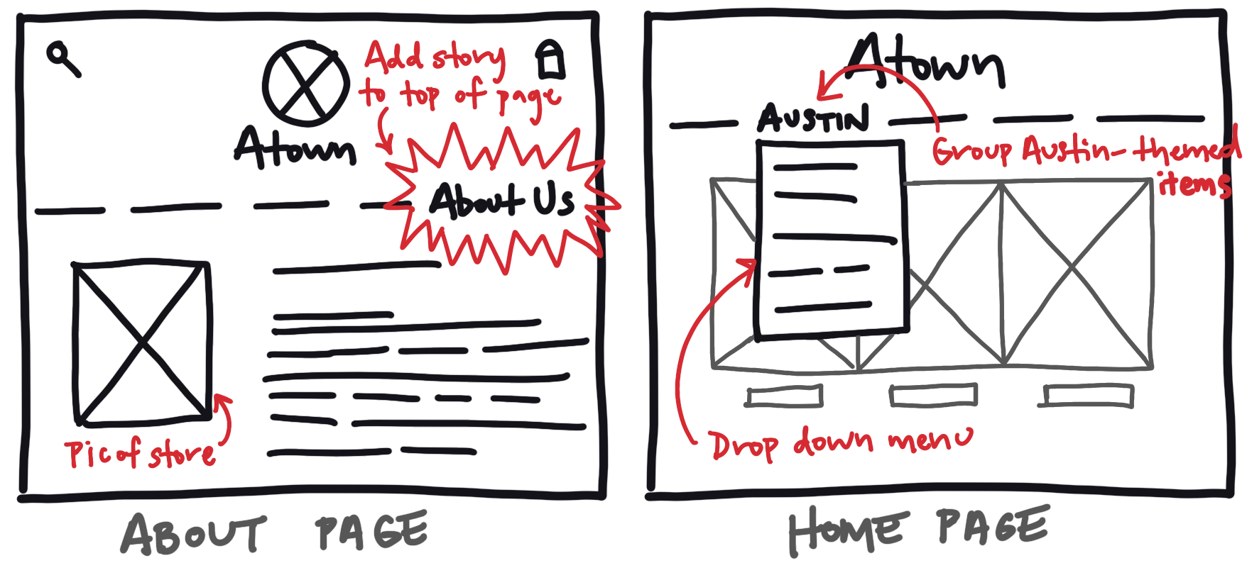
improve hierarchy, especially for "About" section
use consistent branding to create a better experience
display local brands first
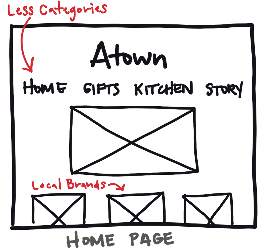
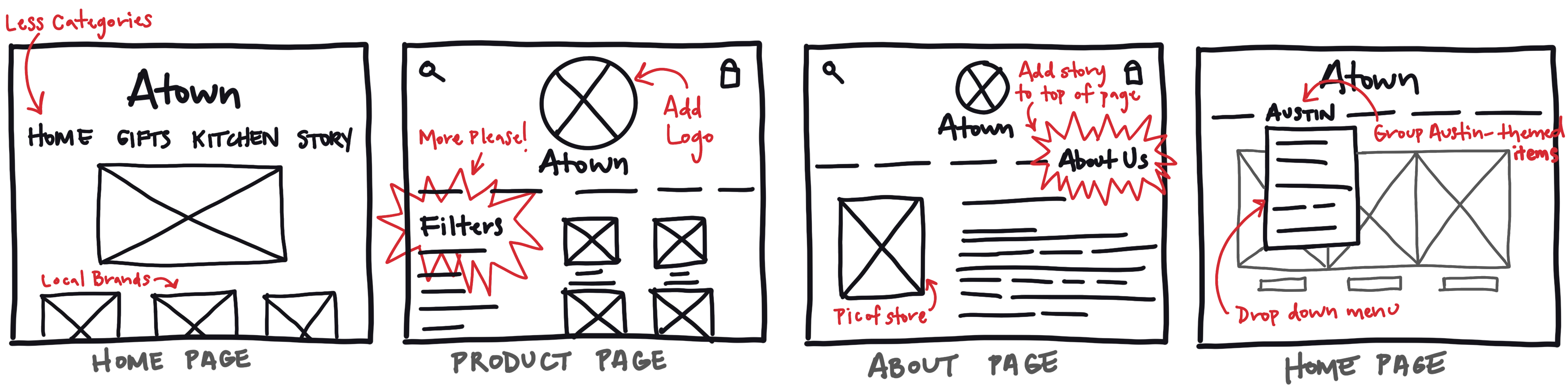
From Sketches to Strategy
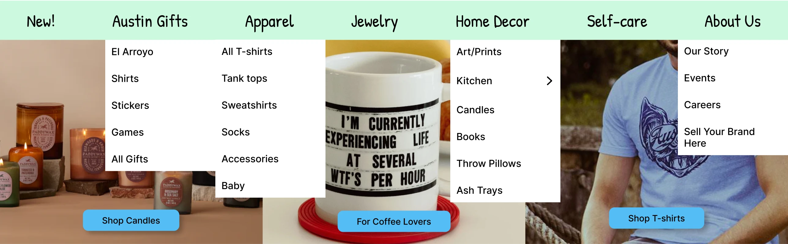
My ideal solution combined most of my sketches into a multi-navigational system, inspired by Anthropologie's website. Research showed users approach searches differently—some use the search bar, others browse headings, and some rely on filters. To accommodate diverse user behaviors, I focused on organizing information clearly and accessibly, starting with a user flow for browsing products.

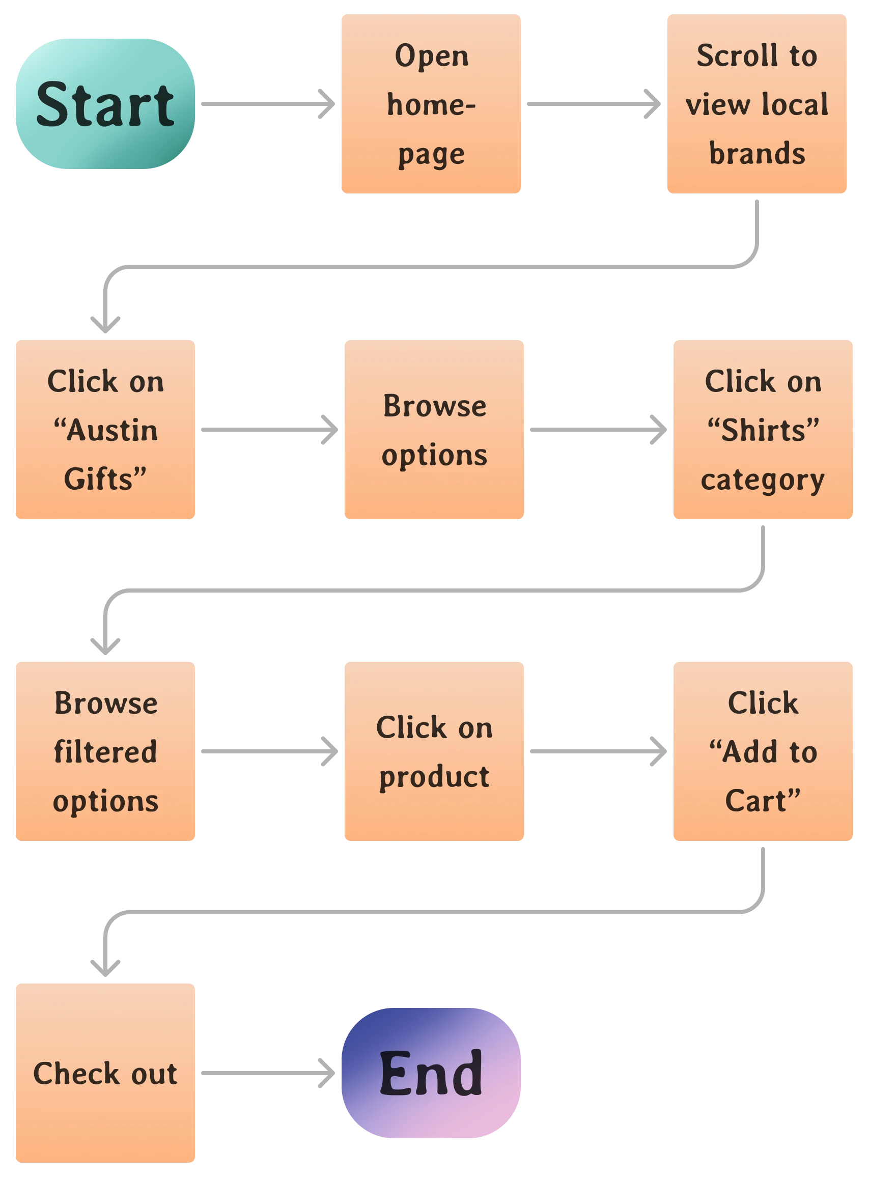

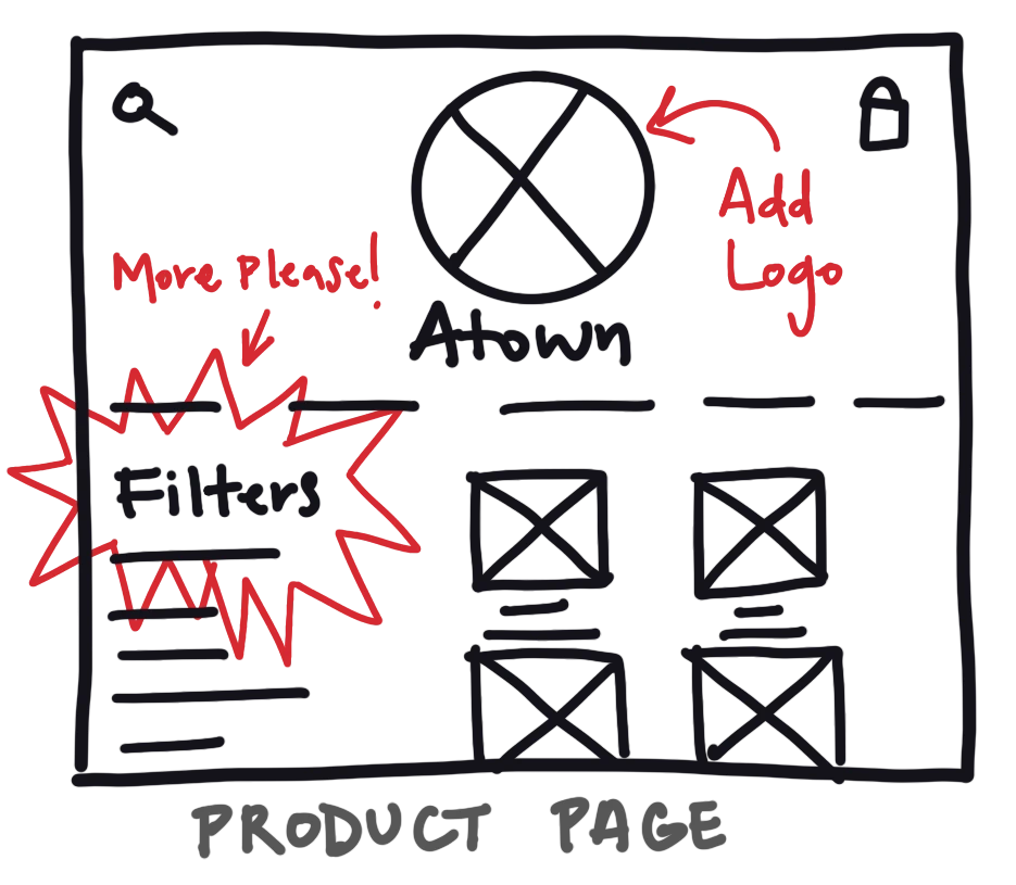
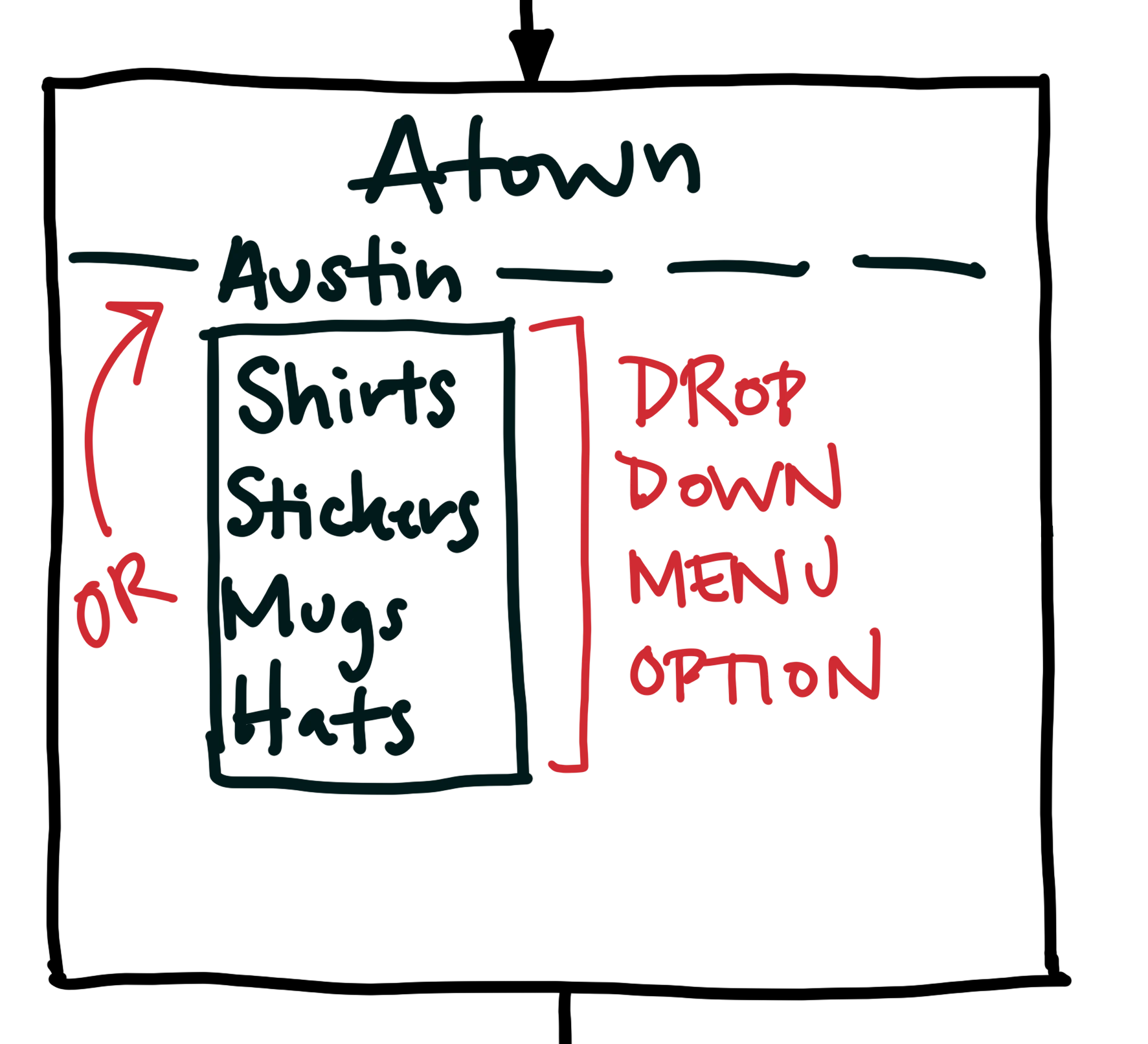
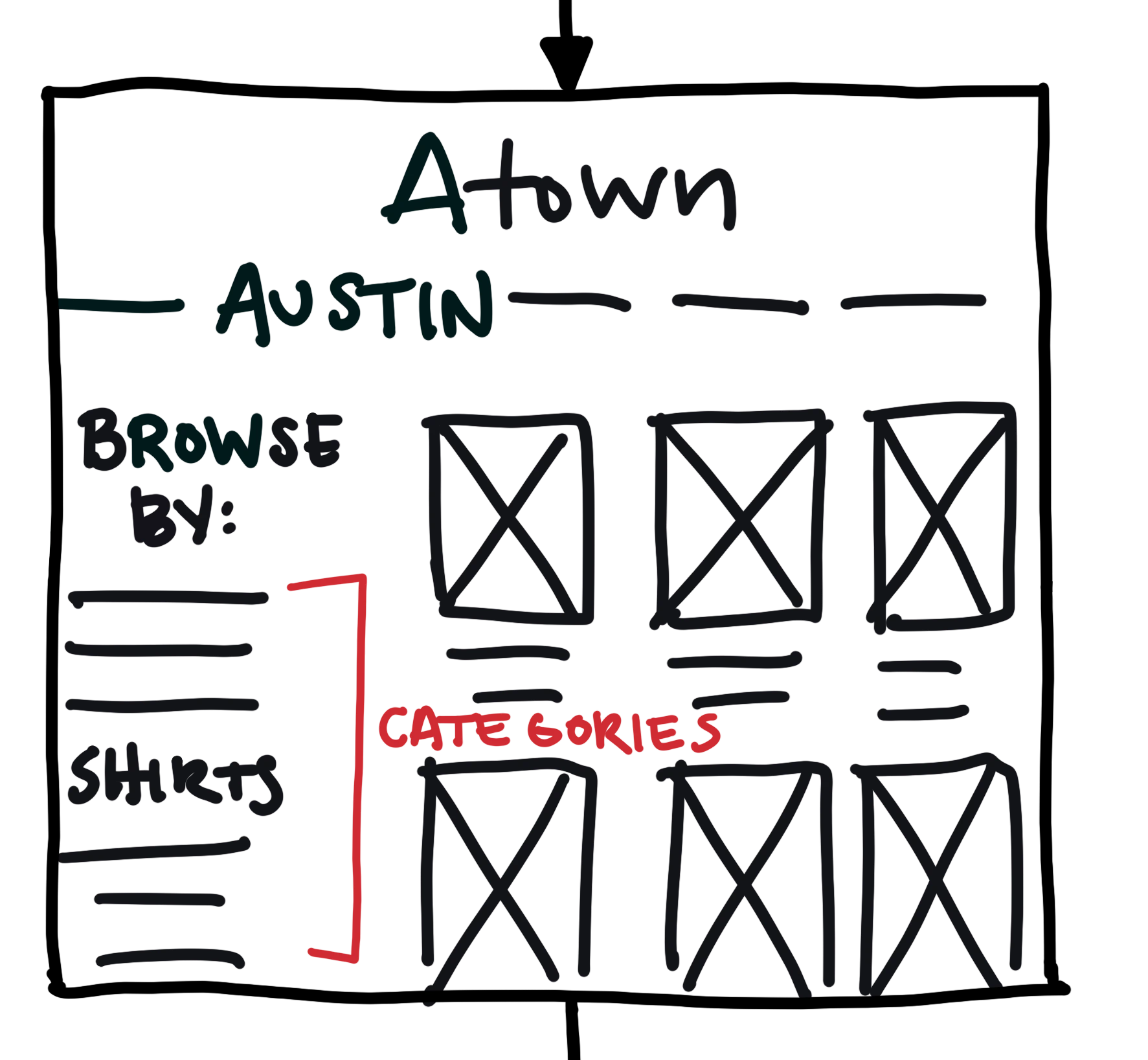
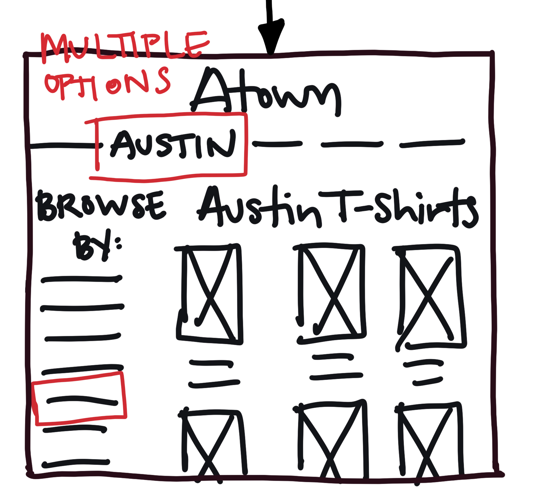
Browse with Ease
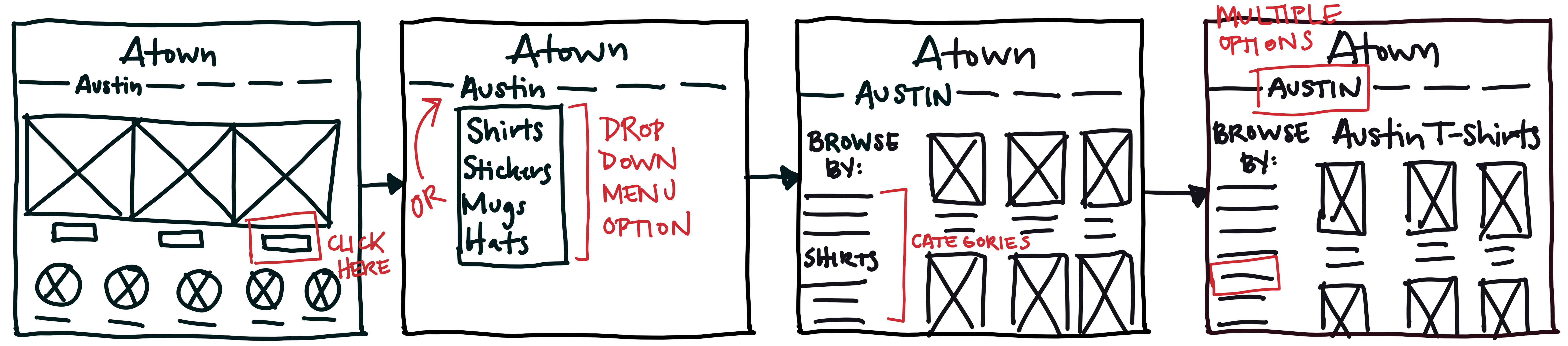
I incorporated a "browse by" sidebar on the product page so that users can clearly see what other categories are available under each heading. This allows for a more concise navigation menu (both global and local) and would keep everything accessible and organized.
Navigation Overload
The Card Sort
4 participants, recruited through social media
Goal: to determine how users categorize the miscellaneous items that Atown offers
The results inspired a brand new site map displayed below
Some misc. items that were tough to categorize (magnets, playing cards, etc.) easily fell into the brand "El Arroyo" since they were the only ones of its kind
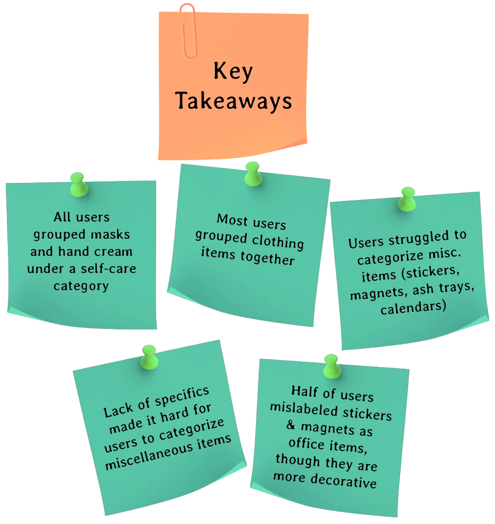

4/4 users
completed the tasks in under 10 minutes with no errors
used the "Browse by" filters to refine their search
3/4 users
scrolled down to look at the "Local Brands" section
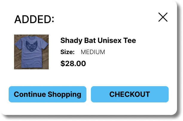
expected to receive feedback after adding an item to cart
2/4 users
scanned the entire homepage before making a decision
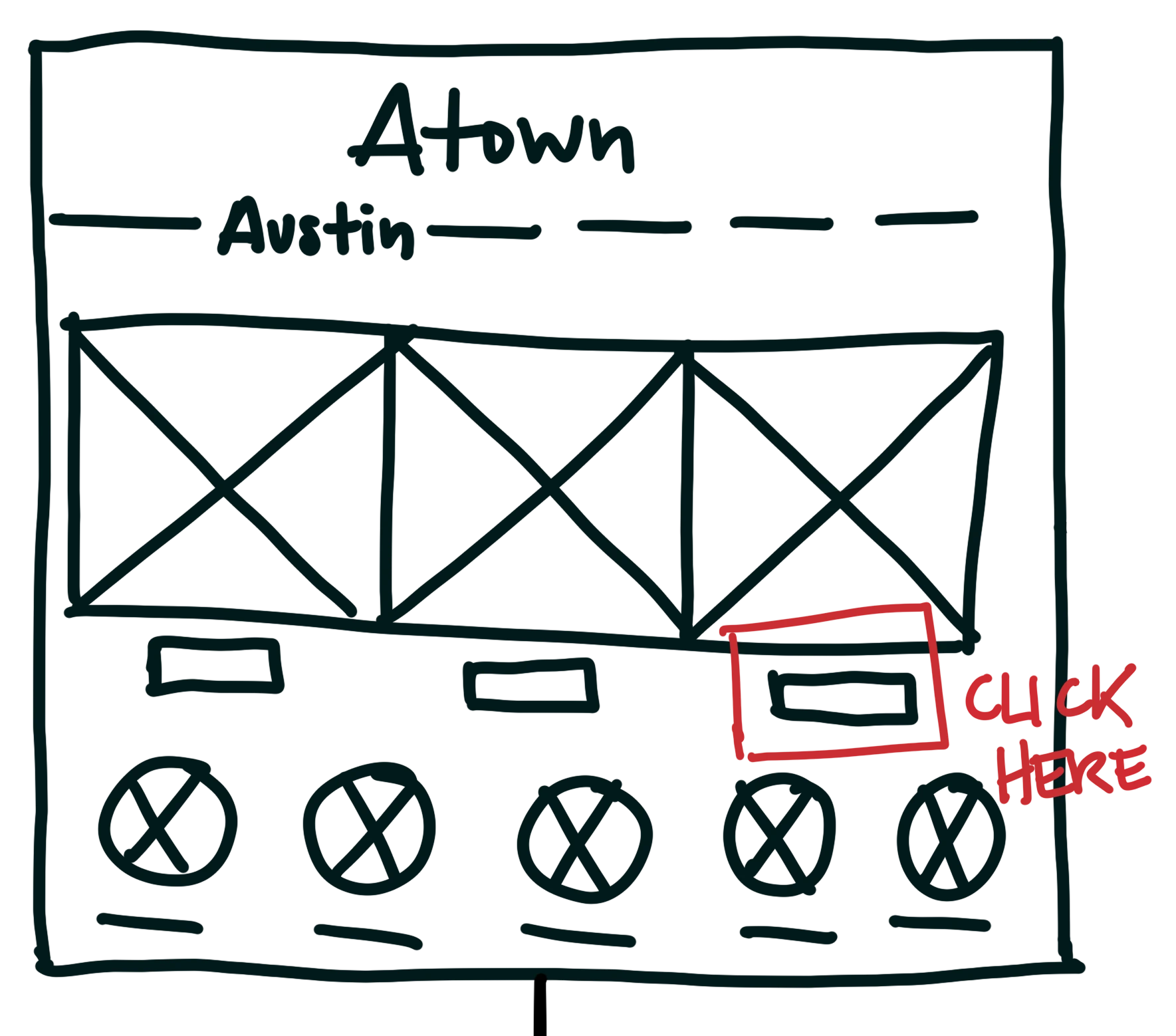
immediately clicked on the feature "Shop T-shirts"
A Shopper’s Journey Refined
In the second round of testing, users experienced smoother navigation but identified a few missing features, like drop-down menus and feedback after adding items to the cart. I added an overlay to confirm cart additions, allowing users to proceed or continue shopping. The Austin-focused filtering system was a hit, making the site easy and enjoyable to use. Inspired by this feedback, I then began to focus on strengthening the site’s branding to enhance the overall user experience.
Painting the Town
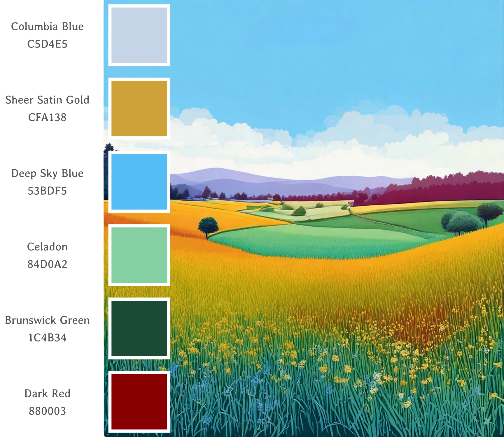

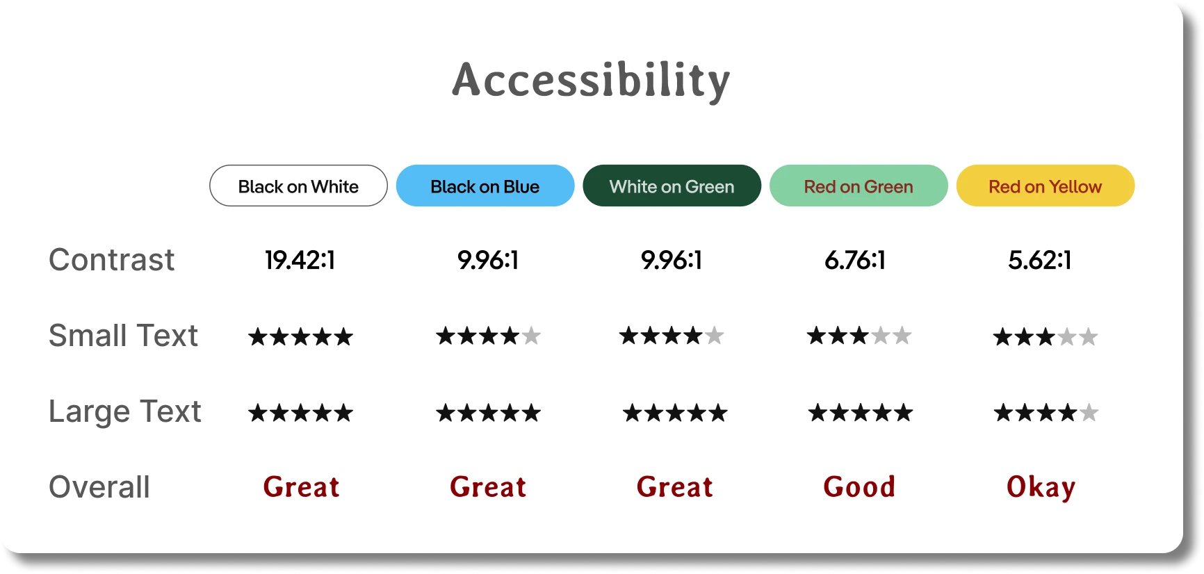
Shades of Inclusivity
To ensure an accessible and vibrant experience for all users, I tested various color combinations for optimal contrast. Of course, black on white provided the best readability, making it perfect for small and large text blocks. Buttons received a touch of black on blue, balancing style and clarity, while white on dark green stood out beautifully in the footer. For a subtle pop, I used red on green and yellow sparingly, reserved for larger text elements.
This thoughtful approach allowed me to create a colorful website that’s not only visually appealing but truly inclusive.
Before & After
Homepage
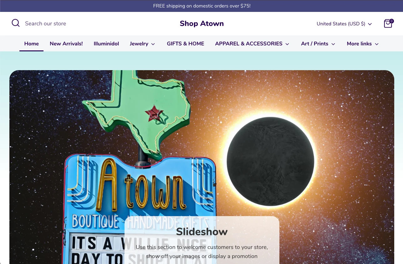
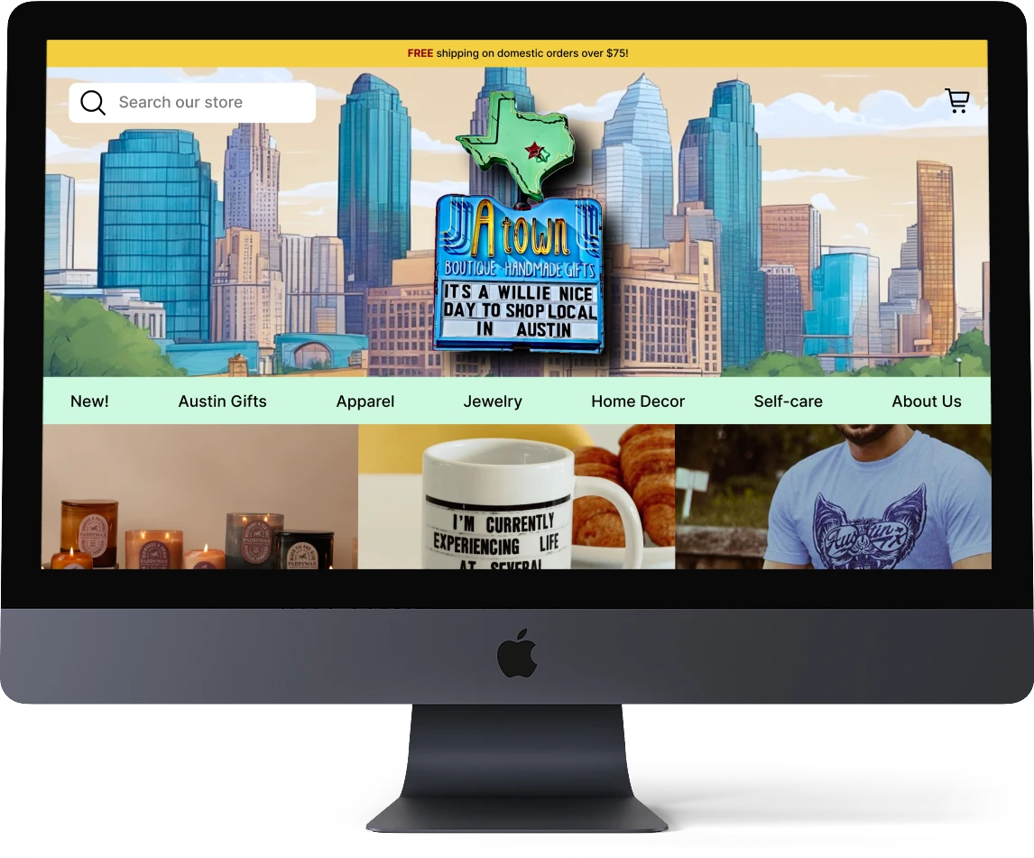
Original Website
Unrelated color scheme
Carousel that accidentally displays a "slideshow" instructional pop-up & lacks relative information
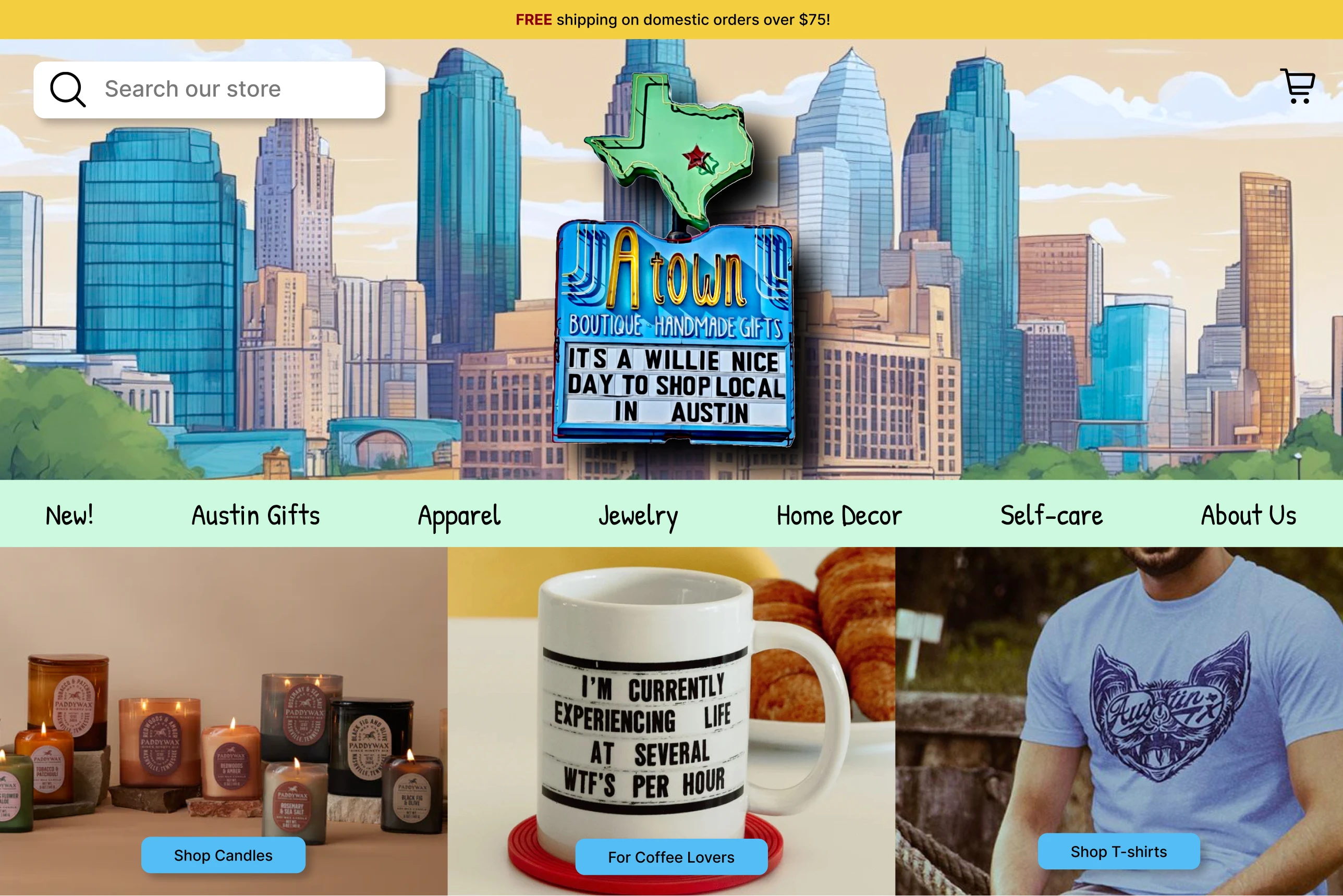
New Design
Cohesive color scheme & clear logo
Cover page displays local art
Immediately features popular item shortcuts
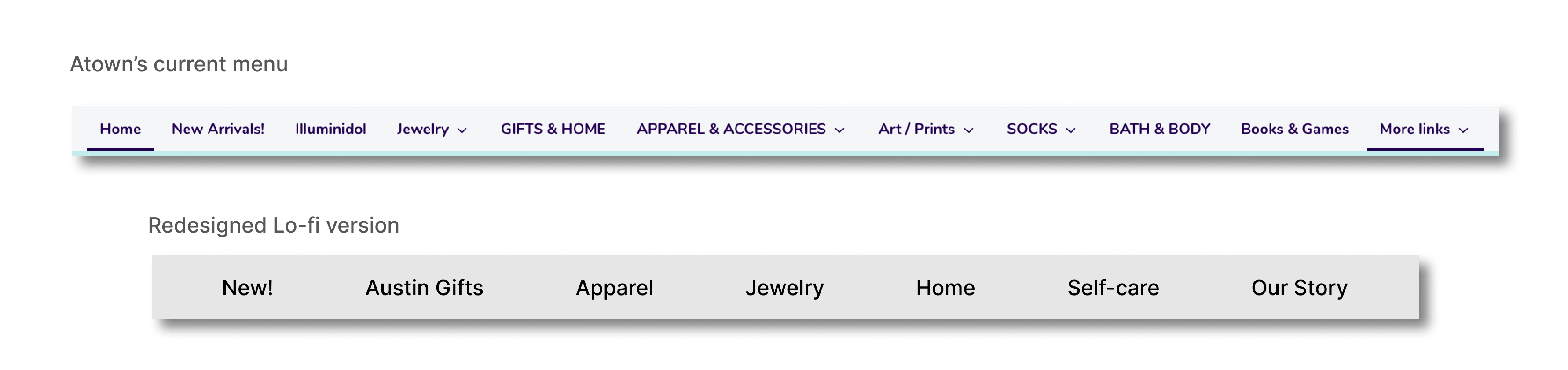
Navigation Menu
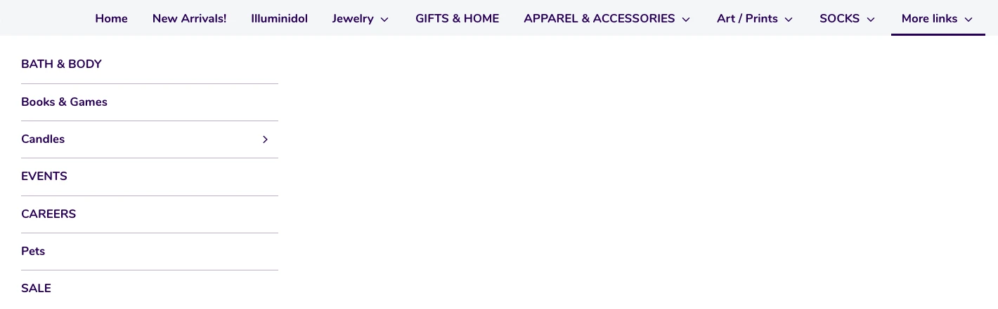
Original Website
Displays a plethora of navigation titles
Additional titles are grouped in "More Links" which is verbose
Lack of consistency in the titles; some are capitalized, some aren't
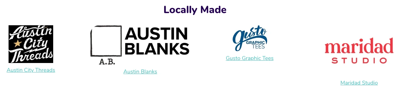
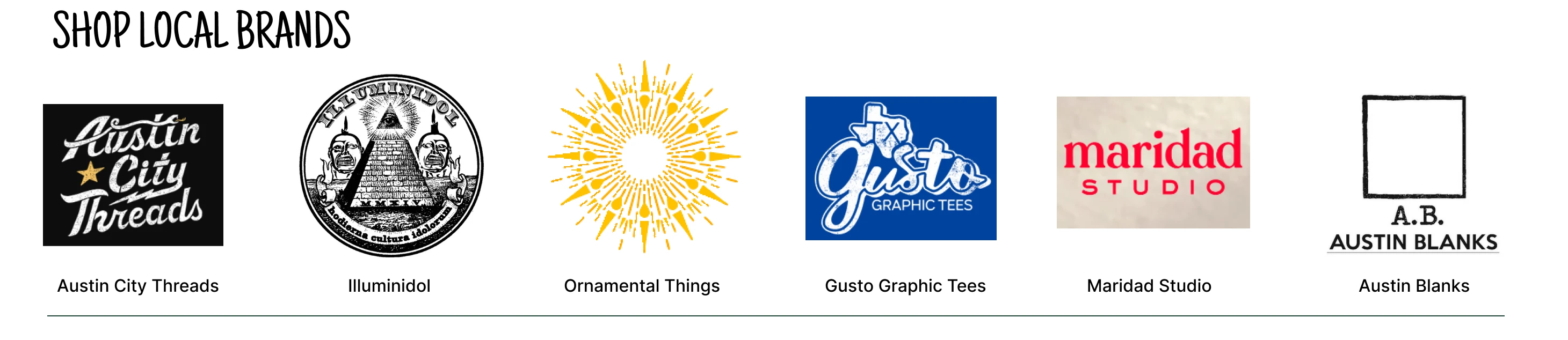
Local Brands Feature
Original Website
These brands are displayed at the very bottom of the page even though it's a large part of the shop's offerings
Logos are all different sizes & unaligned
New Design
Displayed closer to the top of the page to show importance
Increased number of brands & created cards for each brand to have consistency with size and alignment
Moved "Illuminidol" from navigation menu to brands feature
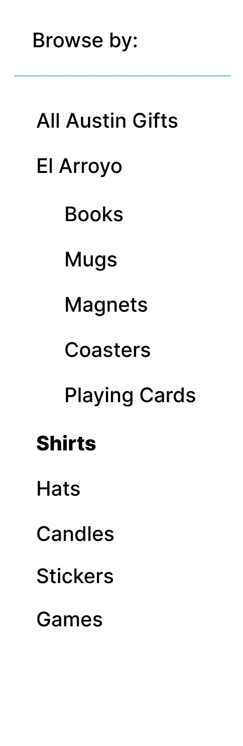
Browse by Category
Brand new feature that allows easy access to all categories within a specific title from the navigation menu
Product Listing Page
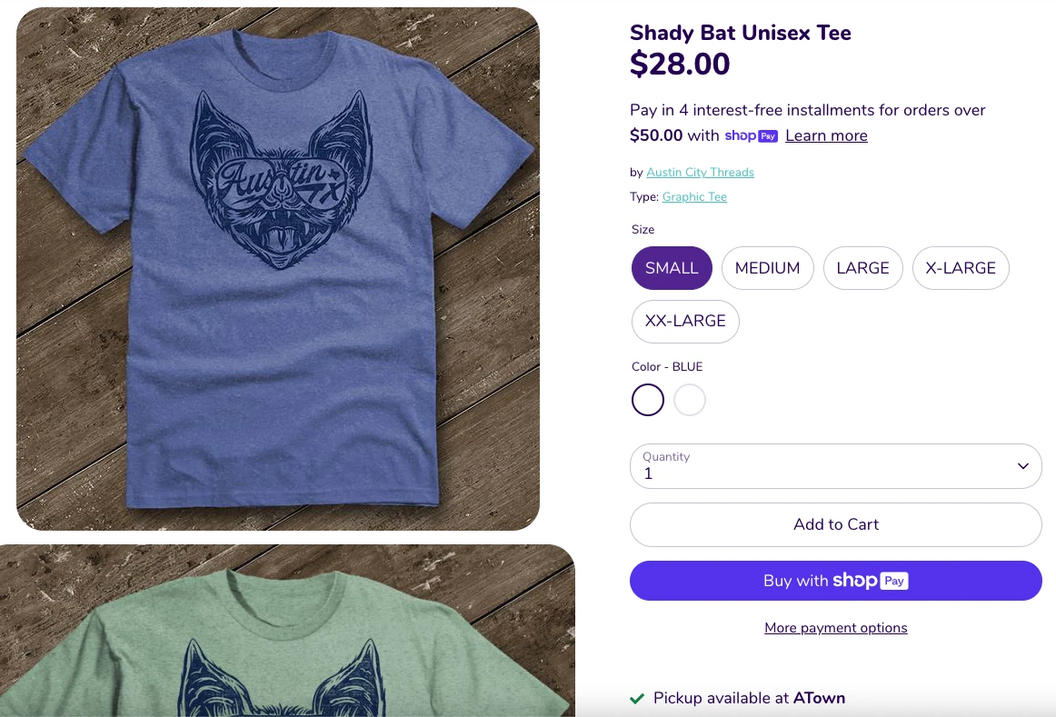
Original Website
Font size, images, & buttons are large and non-responsive to page size
Additional images of product are bigger than the first & stacked vertically; must scroll down to see them all
Colors missing from thumbnail
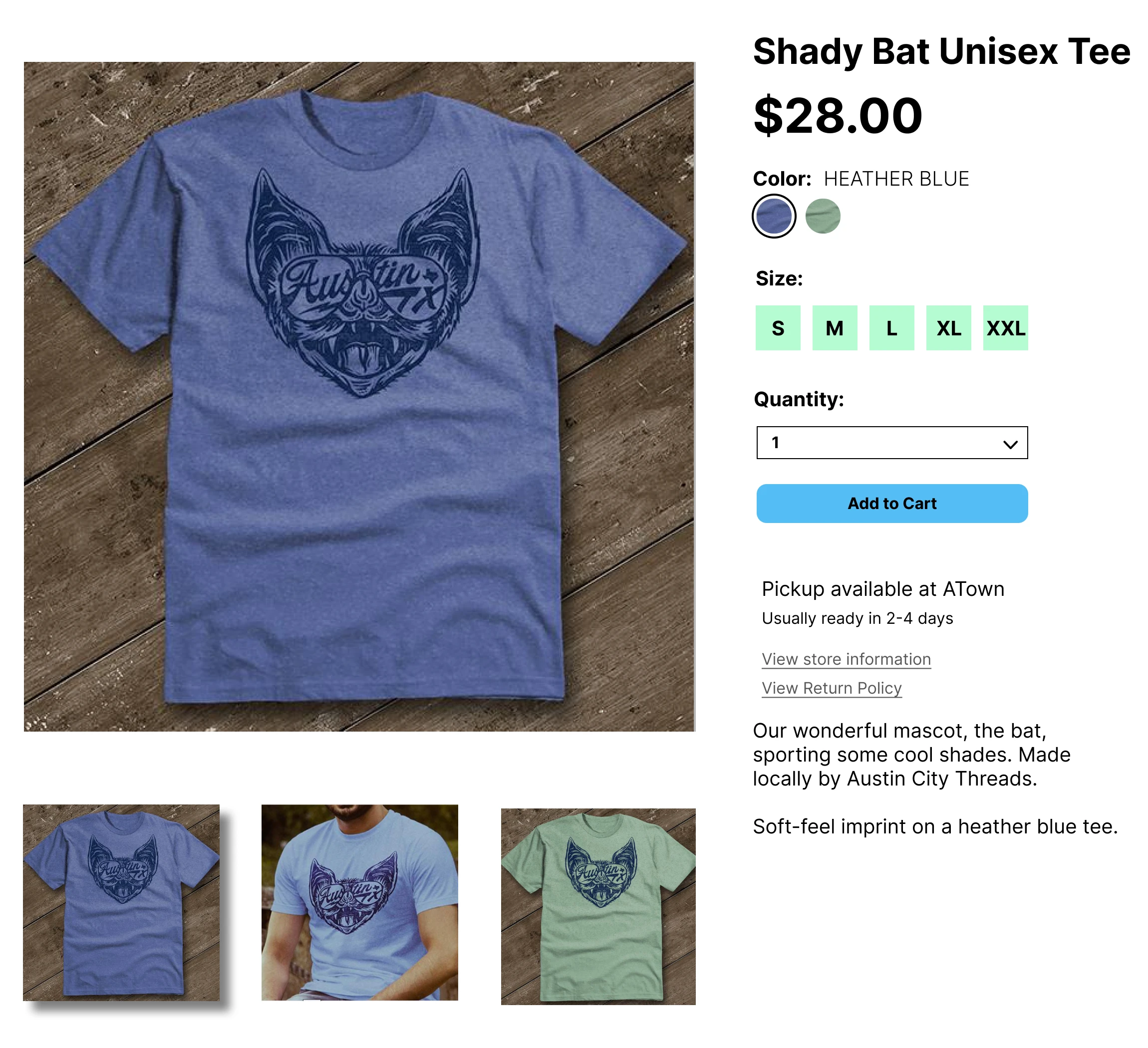
New Design
Main image is the largest; additional images displayed below & replace the large image when clicked
All product info is displayed in viewport, no need to continuously scroll down to see everything
Footer
Original Website
Footer is so large that you need to scroll to see all of it; too much negative space
"About Us" is displayed here instead of at the top of the page which makes it feel unimportant
The color is unrelated to the shop's brand
Entire site is missing shop address, operating hours, & photo
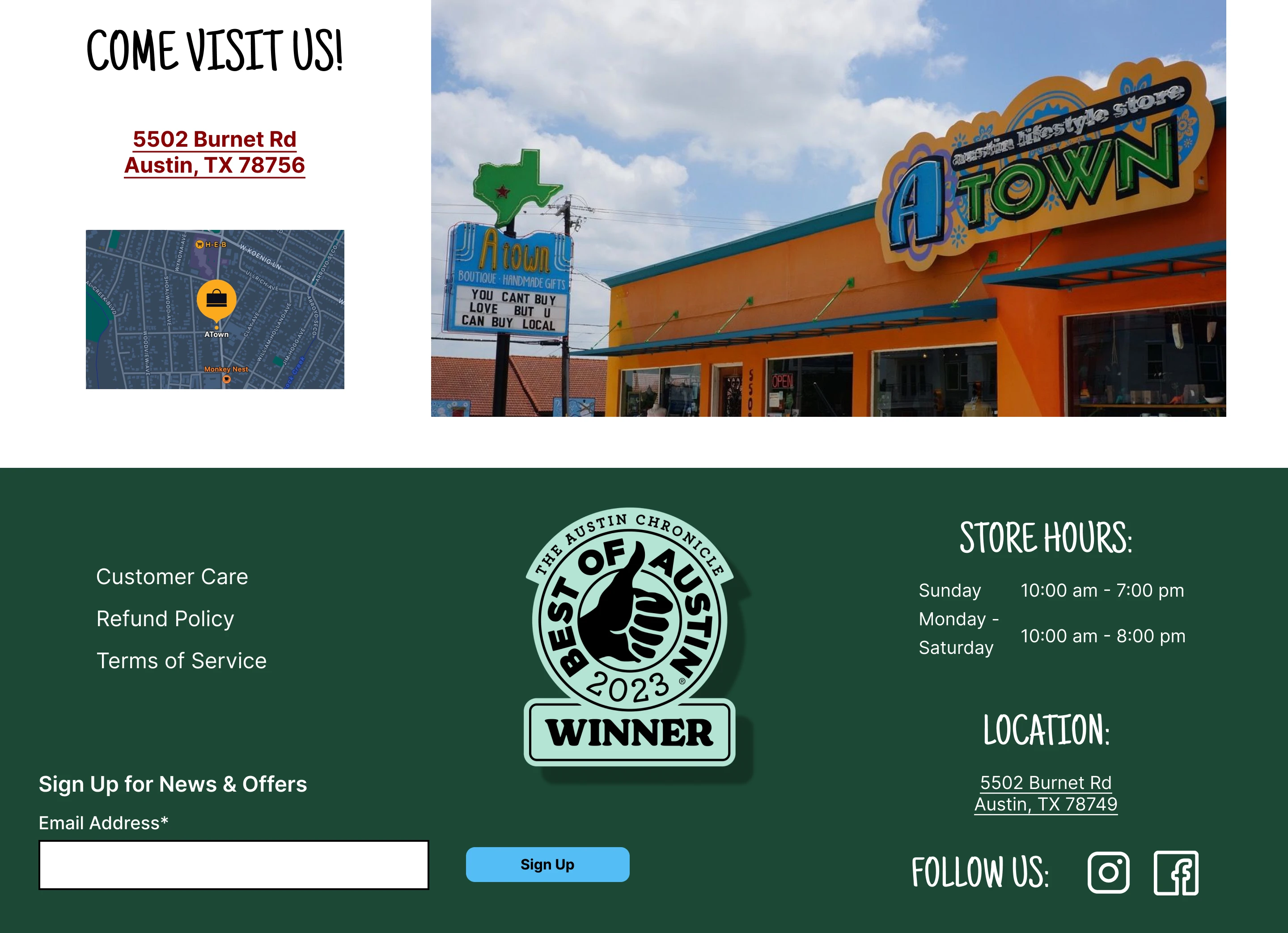
New Design
Moved "Best of Austin" seal from floating in the middle of the homepage to the footer so it shows up on every page
Included shop hours & address to give easy access to this information
Added a photo of the storefront & a map to make Atown easy to find