Designing for the Journey
In the heart of Lonely Planet’s mission, Nomad was born—a digital haven for nomads seeking both workspaces and meaningful connections. The path was shaped by deep user insights and relentless iteration, resulting in an app that not only addresses practical needs but also unites the space between isolation and community.
Empowering the Modern Explorer
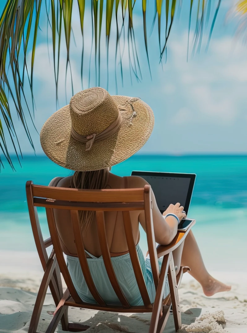
Digital nomads are reshaping work and travel, but often hit walls of isolation and logistical headaches. Enter Nomad.
The challenge? Create a Lonely Planet-inspired app—a seamless, dependable guide for nomads to find community, reliable workspaces, and vibrant local events on the go. My team and I set out with one mission: to empower nomads to thrive wherever they are in the world.
I took the lead on the visual design, diving deep into each detail and making sure everything we crafted felt cohesive and aligned. From sketching to final iterations, I created a style guide to keep every element harmonious. Together, we mixed adventure and design precision into an experience that reflects Lonely Planet’s spirit of discovery.
Join me as we turn a shared vision into Nomad, a concept that brings community and reliability to life on the road.
TIMELINE
3 week sprint
TEAM
Tiana Olivo
Noelle Mendelson
Kate Blodgett
Nema Boye
TOOLS
Figma
Procreate
Google Suite
Adobe Express
Trello
RESPONSIBILITIES
UI & Visual Design
UX Design
Project Management
App Development
Presentation Visuals
Lonely Planet's Core Values
Travel fosters
connection
Empower everyone on their journey

Equip travelers with knowledge
How can we help Lonely Planet better understand and address the unique travel needs of digital nomads, while staying true to its 3 core values?
RESEARCH
Digital Nomad Defined
To understand how to design an app specifically for digital nomads, it was crucial to determine exactly what digital nomads are.
[ dij-i-tl noh-mad ]
Digital nomads are people from all over the world who work entirely remote from locations of their choosing, frequently traveling to new places. I'll refer to them simply as nomads throughout this case study.
Taking all this information into consideration, it was time to embark on a discovery journey.
Voices on the Road
It began with conversations through user interviews. We reached out to four nomads through social media and personal networks, eager to understand their world. From how they plan their trips to what inspires their travels, these insights became the foundation for crafting a solution tailored to their unique needs.
4 participants

Research Objective: To understand the needs and habits of nomads

Insights:
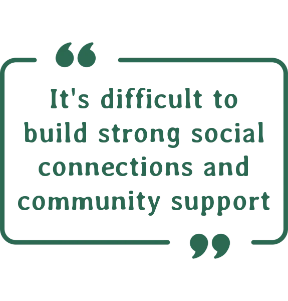
Often experience loneliness and isolation
Search for events to meet like-minded nomads
Finding coworking spaces
Difficulty finding wifi in cafes, hotels, etc

Validating Insights Across Platforms
To validate our interview insights, we analyzed 100+ Reddit posts and YouTube videos from nomads in the wild. The same themes echoed back: loneliness, the craving for connection, and the struggle for reliable Wi-Fi. The alignment across sources made it clear—these were genuine pain points, calling for thoughtful solutions.
SYNTHESIZE
Introducing Izzy
To nail down the problem, we brought our target audience to life through a single user persona. Now, we know exactly who we're designing for—and how to make it work for them.
Understanding Izzy
Values other nomads' experiences
Needs quick access to coworking facilities, food & events in the area
Is frustrated when it's not always easy to meet people and stay connected

Solving for Connection and Productivity
With Izzy as a guide, we uncovered key needs that every nomad faces:
Digital nomads need quick access to detailed information on work-friendly destinations and opportunities to connect with other nomads to combat loneliness while traveling.
With these needs now in focus, the next step was to explore creative ways to address these challenges and provide meaningful solutions.
So How Might We…

...provide a way for nomads in the same area to connect & build community?

...allow nomads to share their experiences and tips?

...integrate reviews & ratings for coworking spaces and accommodations?

...provide nomads with up-to-date resources of local coworking spaces & internet connectivity?

...remove the loneliness out of traveling?
Turning Insights Into Wire Flows
Loneliness and isolation? Yep, they came up a lot in our research—right alongside practical struggles like finding reliable work spots. So, we asked ourselves: how do we tackle both? With our core values—Connect, Empower, Equip—leading the way, we set out to create a platform that blends community with useful resources for nomads.
Then came the fun part: sketching out ideas. We played with wire flows, dreamed up features like coworking filters, maps, and DMs with fellow nomads.
Wire flow #1
Wire flow #2
Inspiration from the Digital World
With our key screens in mind, I turned to other websites and apps for a spark of inspiration. I explored how platforms like Yelp, Facebook, Airbnb, Partiful, and Lonely Planet handled posts, events, home pages, and listings.

Yelp influenced the design of user-generated posts for easy sharing and reviews

Facebook informed the layout of the connection pages, enhancing user interaction
Airbnb’s review cards shaped the visual design, highlighting user feedback effectively

Partiful gave valuable insights for the event page

Lonely Planet’s homepage inspired the layout and navigation for quick access to information
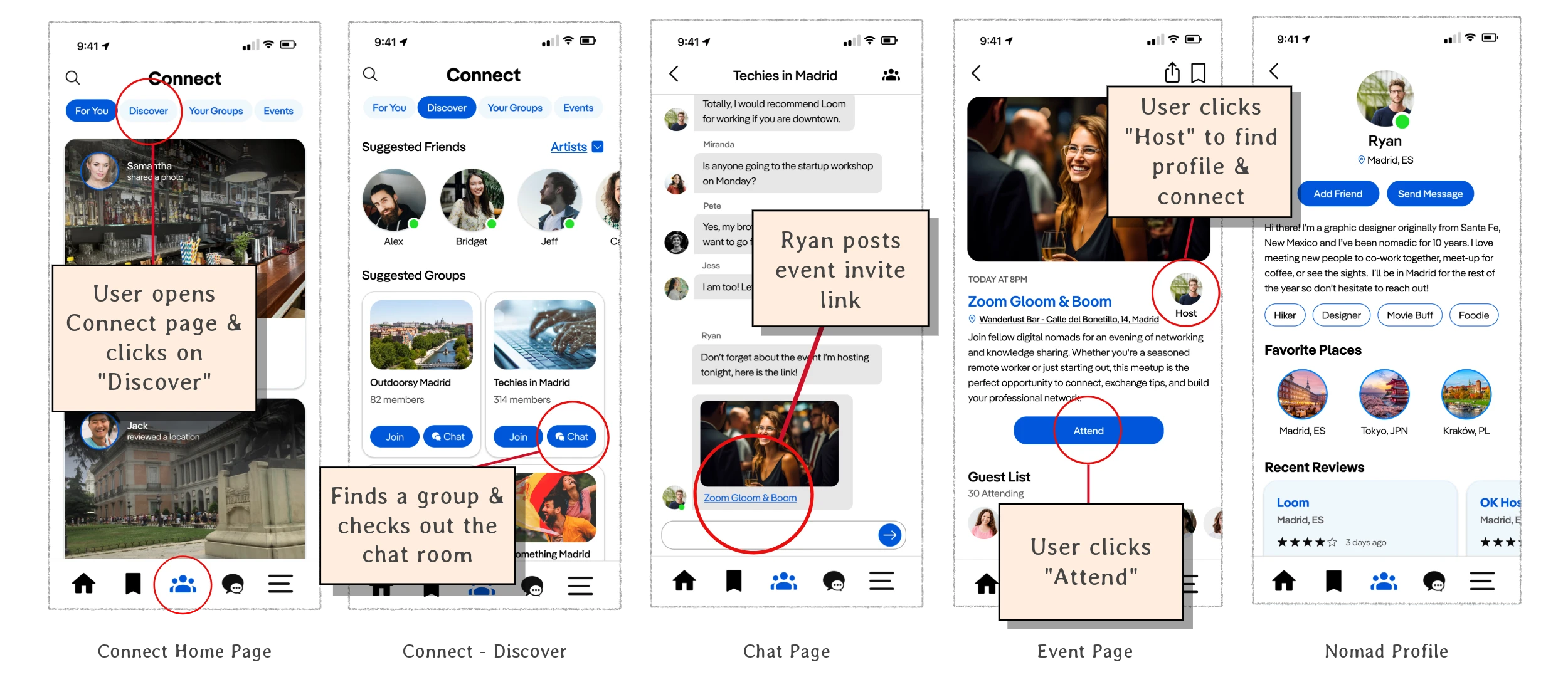
From Review to Invitation
From the initial sketches and inspired designs, the first lo-fi wireframe prototype was created. In this flow, a user navigates the coworking space page, spots an active nomad in the reviews, sends them a message, and receives an event invitation. The user marks their attendance at the event. This flow became the first solution for fostering connections between nomads on the app.
Nomad's First Challenge
The next step was to put the prototype to the test. Nomads were recruited through our team's personal networks, ready to dive into the experience. The goal? To see if they could easily browse coworking spaces and connect with fellow nomads in the same city. It was time to find out if this solution really worked in the world of wanderers.
4 participants
Research Objective: To determine if users can successfully browse for a coworking space and connect with people in the same city

Goals:
Find a coworking space in under 5 minutes
Connect and chat with another user with less than 2 errors
Sign up for an event from the new connection
Results & Insights:
4/4 users
immediately used the filter option to refine results
failed to connect with other nomads through the profile page
3/4 users
easily searched & found a coworking space
made no errors accepting event invite & signing up
All 4 users found the profile and review features unclear when trying to connect with other nomads. This insight revealed a critical issue in the original user flow, highlighting the need for a more intuitive path to connection.
A key insight hit me: my initial sketch had some wrinkles that needed ironing out.
VISUAL DESIGN
Splash On the Tang Blue
The design had potential, but only passed a handful of the tasks from usability testing. It wasn’t until color and essential improvements were added that it truly felt complete. Plus the visual design aspect of UX is one of my favorite parts so this is where I truly got to shine and lead my team towards an aesthetically pleasing design.

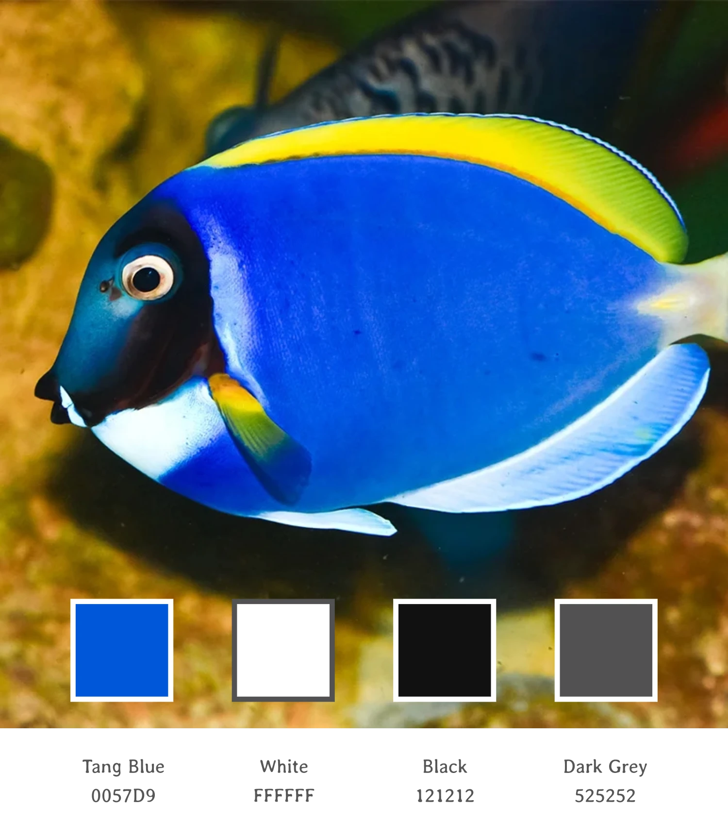
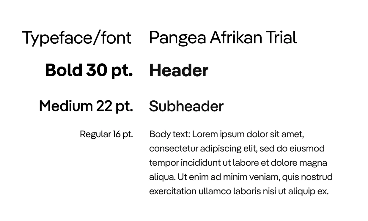
Luckily Lonely Planet provided clear, accessible branding that helped guide the way for me to truly bring this prototype to life. My job was to turn that into a visual style guide we could use in our final design.
All that was left was to find a typeface similar to LP's website and logo then use sizing consistent with industry standards.
New App, New Logo
A new app calls for a fresh logo. It was key to keep the branding in sync with Lonely Planet—something instantly recognizable and seamlessly familiar. To keep things simple, I proposed we name it "Nomad" and matched the Lonely Planet font and color, with “by Lonely Planet” beneath for that unmistakable ownership and recognition.

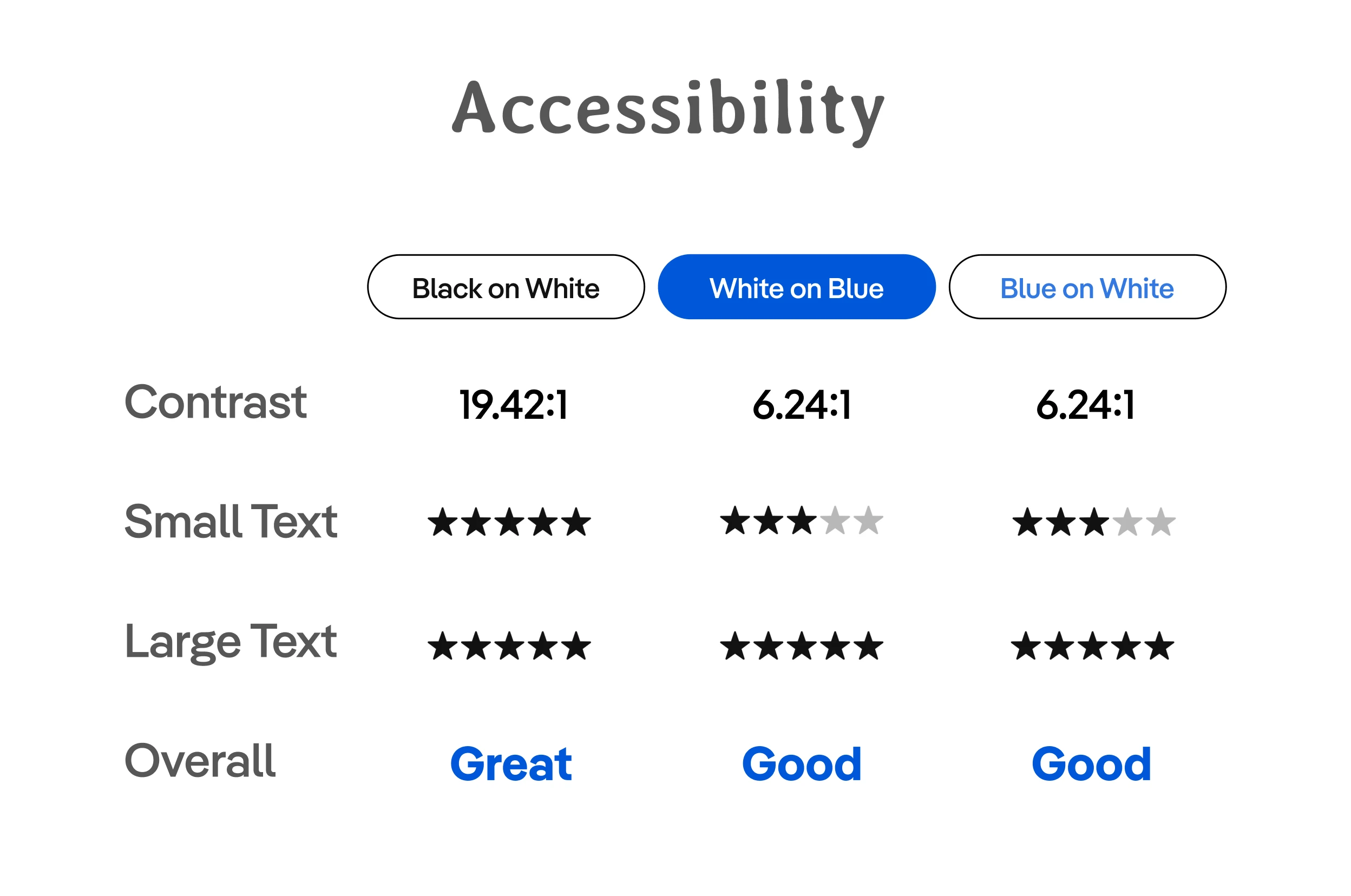
Bold Choices, Clear Views
Visual accessibility was front and center in every design decision. Black on white? Gold standard. Tang blue on white? Maybe not top marks, but it passed all tests, so it earned a place for bold, bigger text. And after a color blindness test, we were all set—the app works for every kind of color vision.
Refining the Vision, One Pixel at a Time
With typeface, color, and accessibility locked in, it was time to dive into the finer details. I tackled several key aspects of the final design (listed below) and stepped into the role of chief polisher, refining each screen my team crafted to ensure everything was aligned, consistent, and gorgeously cohesive.
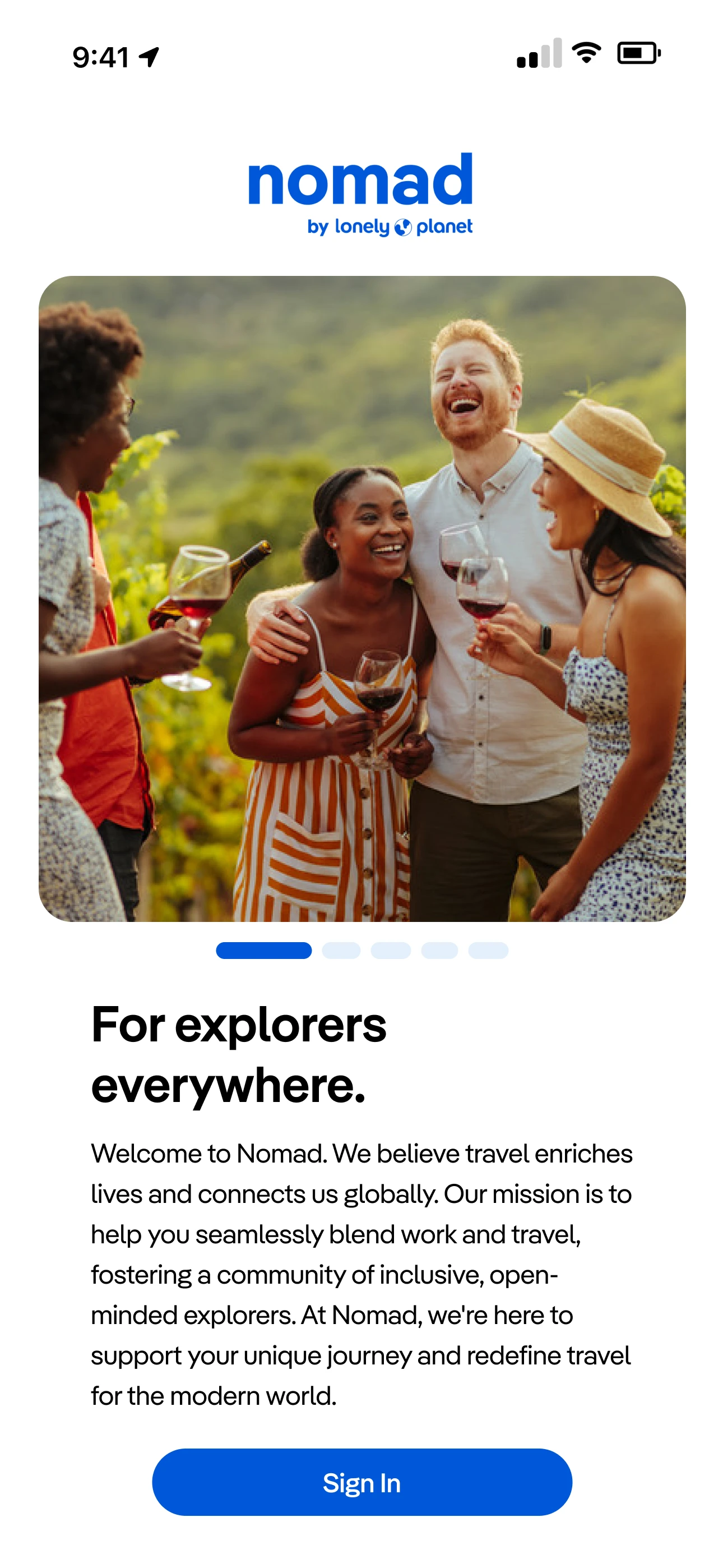
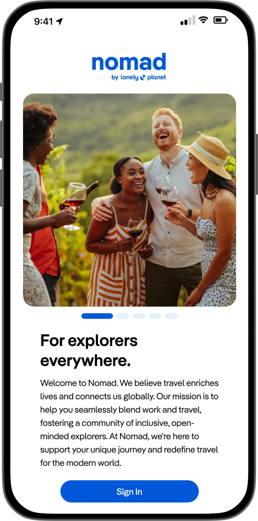
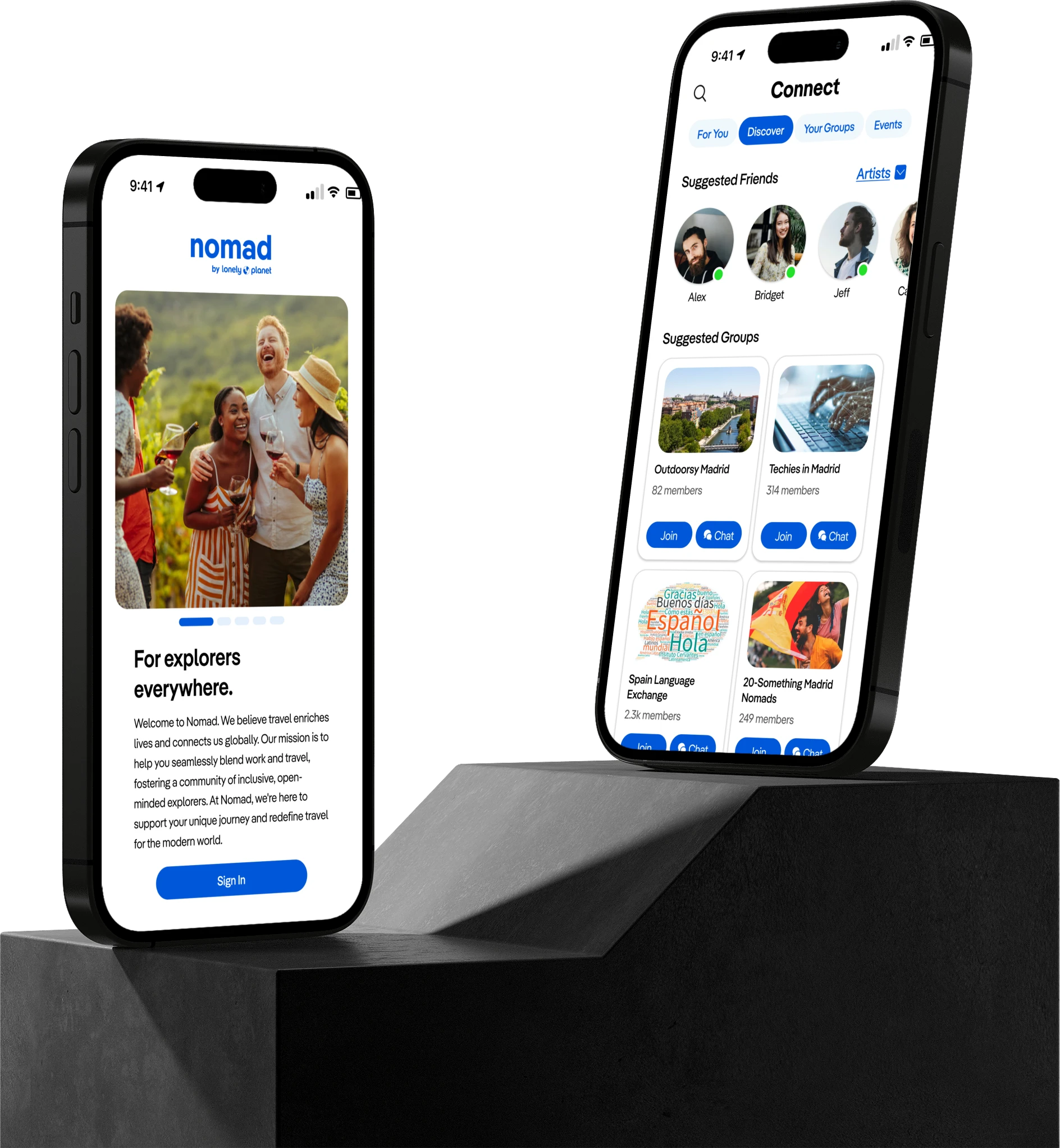
Landing Page
included new logo
large photo of travelers
simple welcome paragraph with mission
large, colorful sign in button
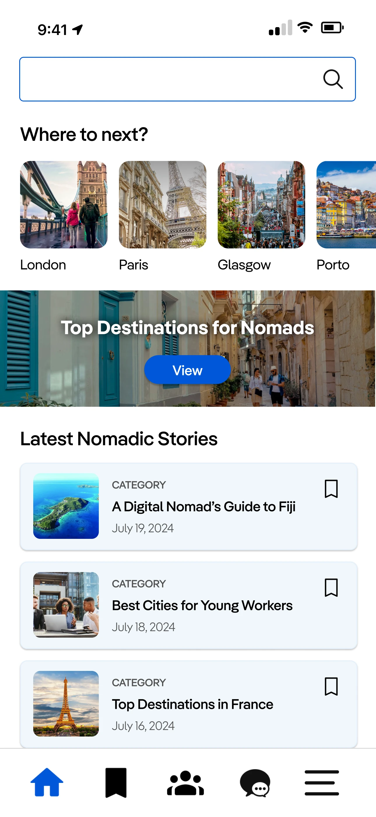
Home Page
reflects Lonely Planet's website for consistency
colorful, hi-def photos
provides suggestions to give a sense of direction
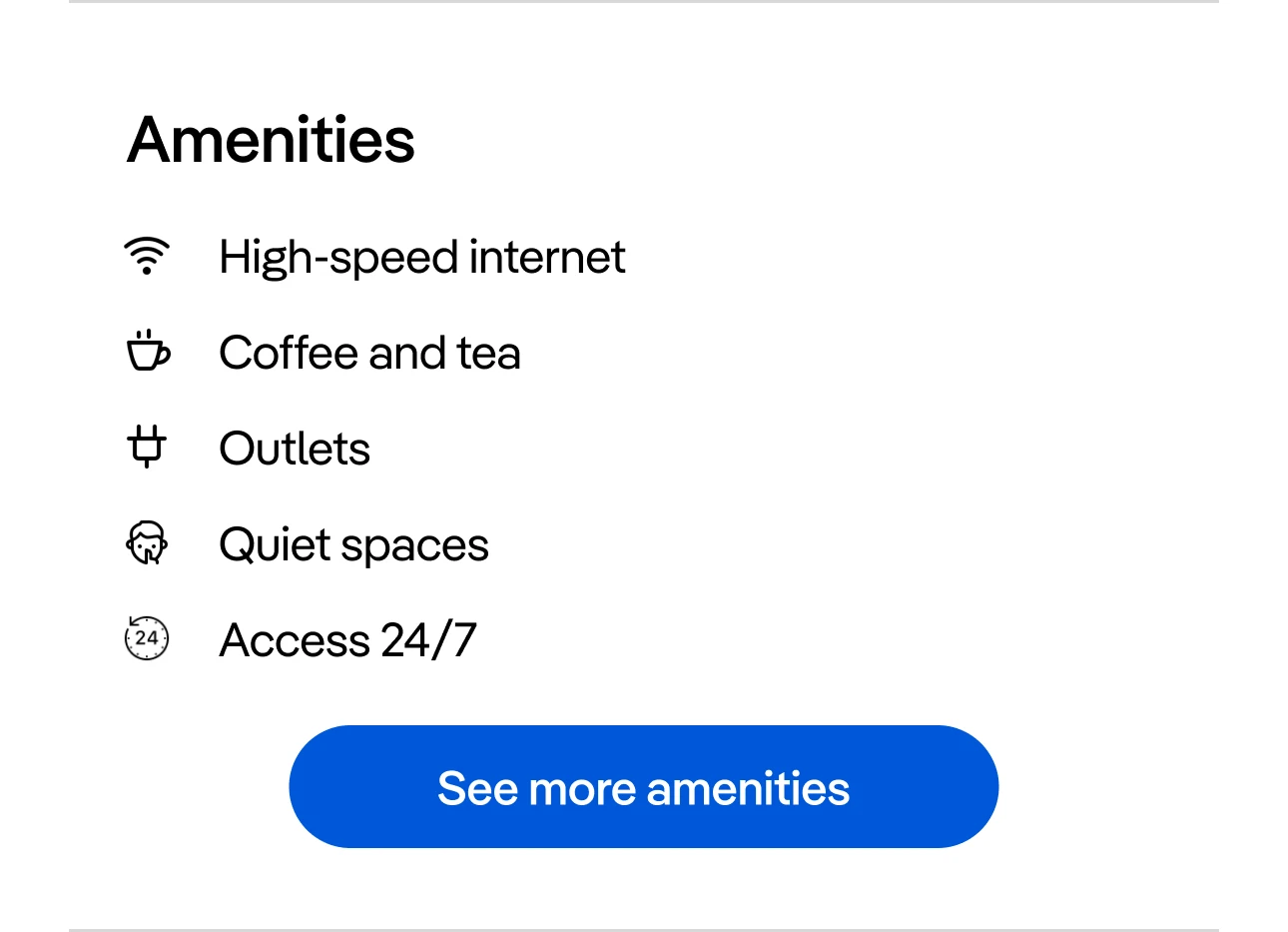
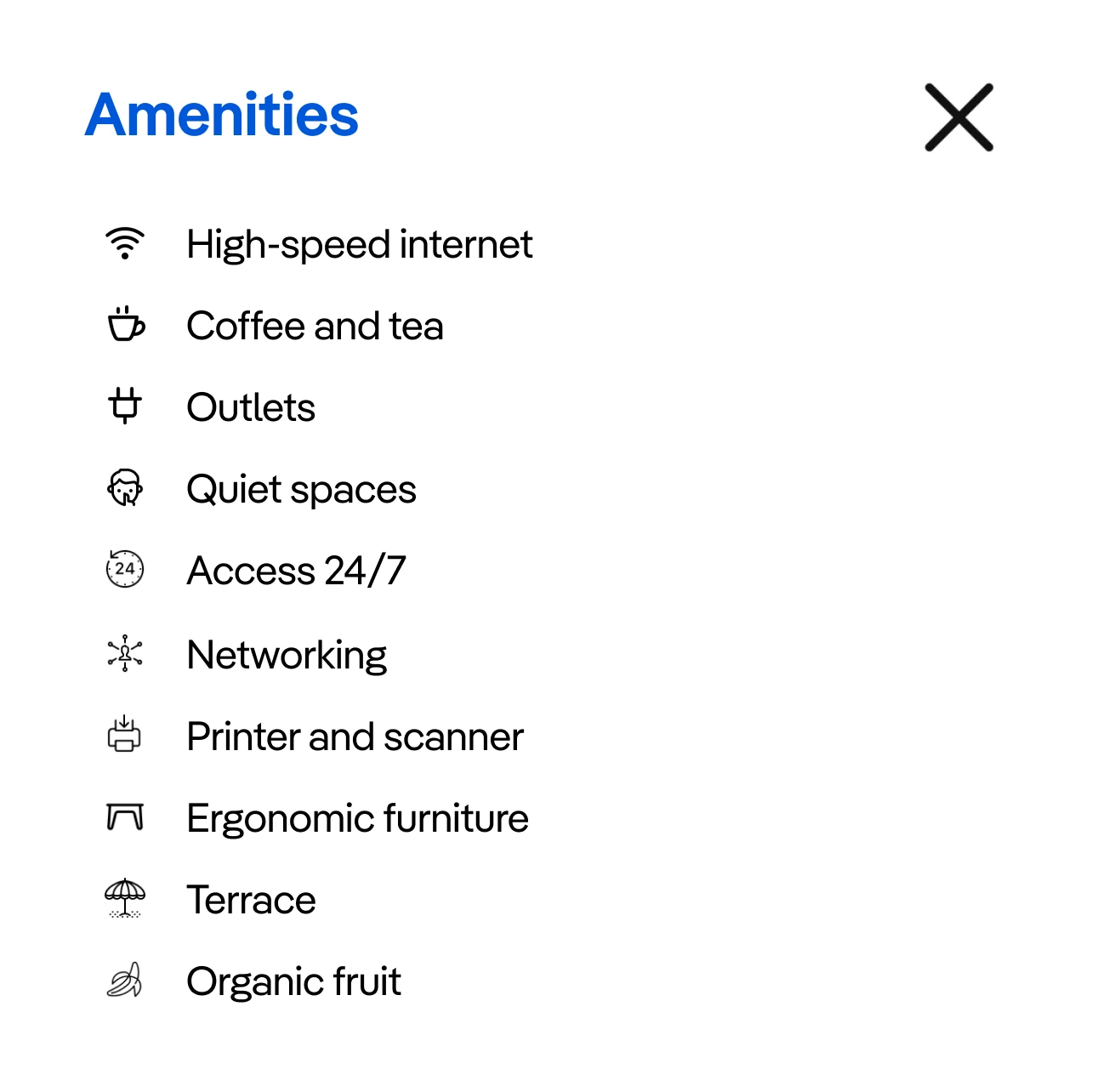
Amenities
added list of available amenities to cowork listing page
included clear, descriptive icons for familiarity
click on "See more amenities" to open an overlay of all available offerings from each coworking location
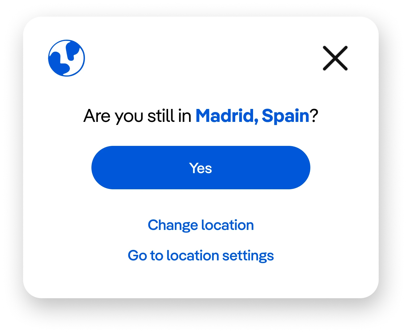
Set Location
pops up after signing in or re-opening app
reminds user to set location for accurate recommendations
keeps profile updated with current location
can be disabled in settings
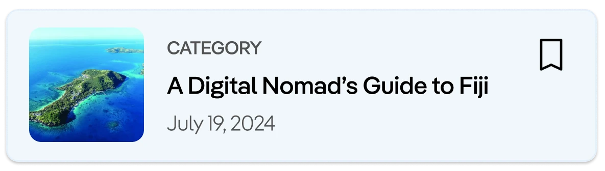
Story Card
matches style from LP's website
offers the user stories and articles written for or by fellow nomads
allows user to bookmark page to read later
Rewriting the Nomad Narrative
The first round of usability testing revealed just how essential it was to emphasize human connection within the app. This led to a whole new user flow and a dedicated section for connecting with other nomads. Now, users can not only search for workspaces, restaurants, accommodations, and activities but also discover and connect with like-minded nomads and groups—tackling two of the biggest challenges for digital nomads in one place.
Nomad's Second Challenge
It was finally time to take our hi-fi prototype to the test, this time with 3 participants gathered from our team's social networks. It was crucial to keep the same tasks to see if our improvements made a difference.
3 participants
Research Objective: To determine if users can successfully browse for a coworking space and connect with people in the same city
Goals:
Find a coworking space in under 5 minutes
Connect and chat with another user with less than 2 errors
Sign up for an event from the new connection
Results & Insights:
3/3 users
found a coworking space right away with no errors
attempted to book the coworking space before deciding to save it instead
2/3 users
easily found an event to attend
1/3 users
had trouble navigating the menu icons